Hi there,
List View Charts in Salesforce are a simple way to visualize records directly on an object page.
They allow you to transform a filtered list of records into a chart, providing a clear view of your data without requiring a report.
If you want to know more about List Views themselves, check out our earlier blog:
List Views in Salesforce
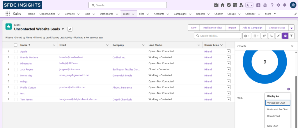
What are List View Charts?
List View Charts are:
- Object-specific – Each chart works for one object.
- Driven by List View filters – Only the records in the list are included.
- Available in Lightning Experience – They appear only in Salesforce Lightning.
The List View decides which records to show, and the chart just visualizes them. No separate data source is needed.
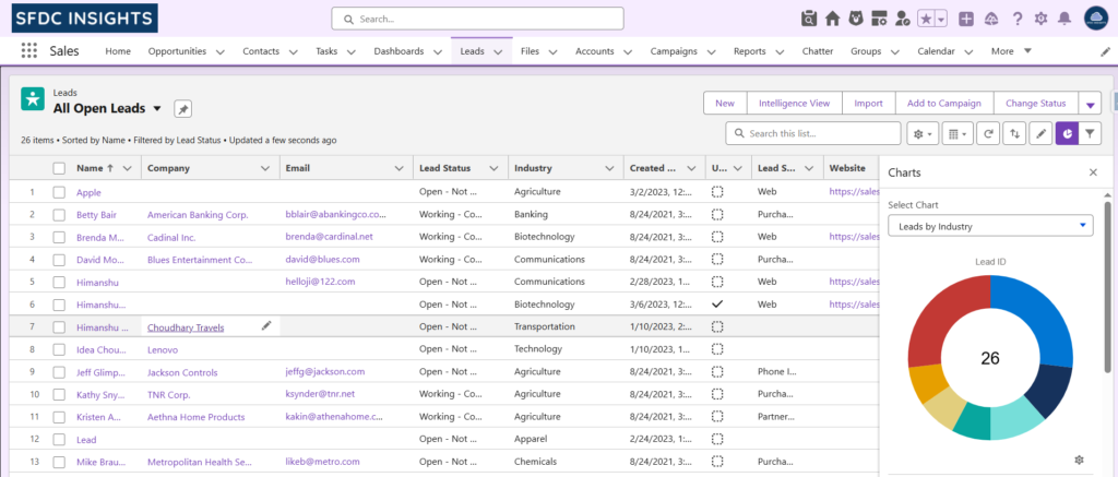
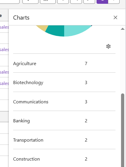
Example: Leads by Industry
Let’s create a List View chart to show Leads by Industry. We’ll use a List View that shows all open leads, and the chart will display the number of leads coming from each industry.
How to Create a List View Chart
- Open the Leads object.
- Switch to or create a List View, e.g., Leads by Industry.
- Click the Show Charts toggle on the List View page.
- In the chart panel, click the Settings (gear) icon.
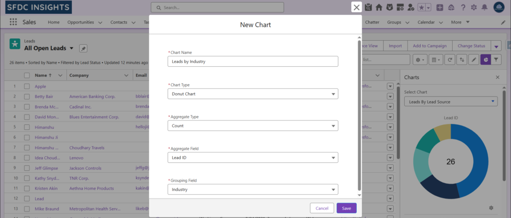
- Click New Chart.
- Fill in the chart details:
- Chart Name: Leads by Industry
A descriptive name helps users understand what the chart represents. - Chart Type: Donut Chart
Donut charts are great for seeing distribution. Bar charts are better for comparisons. - Aggregate Type: Count
This defines what Salesforce calculates. Count shows how many records match the List View filters. - Aggregate Field: Lead Id
Salesforce requires a specific field to count. Lead Id works perfectly because it exists on every record and is unique. - Grouping Field: Industry
This determines how records are grouped in the chart. Using Industry shows which industries have the most leads.
- Chart Name: Leads by Industry
- Click Save.
The chart will now appear whenever this List View is selected, showing the number of leads per industry.
Why List View Charts are Useful
List View Charts are designed for quick, day-to-day insights:
- Show real-time data
- No reports needed
- Work directly with existing List Views
- Records remain clickable and actionable
For sales and support teams, this reduces context switching between List Views and reports.
List View Charts vs Reports vs Dashboards
| Feature | Best For | Notes |
|---|---|---|
| List View Charts | Quick insights, record-level | Works directly with List Views |
| Report Charts | Analysis and trends | Supports grouping & calculations |
| Dashboards | High-level visibility | Focused on KPIs, not individual records |
In short: List View Charts are for action, Reports are for analysis, Dashboards are for visibility.
When to Use (and Not Use) List View Charts
Use them when:
- You already have a useful List View
- You need fast visual insights
- You act on individual records
Avoid them when:
- You need historical trends
- Complex logic or formulas are required
- Data spans multiple objects
Final Thoughts
List View Charts don’t replace reports or dashboards, but they complement them well.
Even a small chart on a List View can make your data easier to understand and save time in daily work.
Small, practical features like this often make the biggest difference in productivity.
Stay tuned for more practical Salesforce tips and tricks on SFDC Insights.